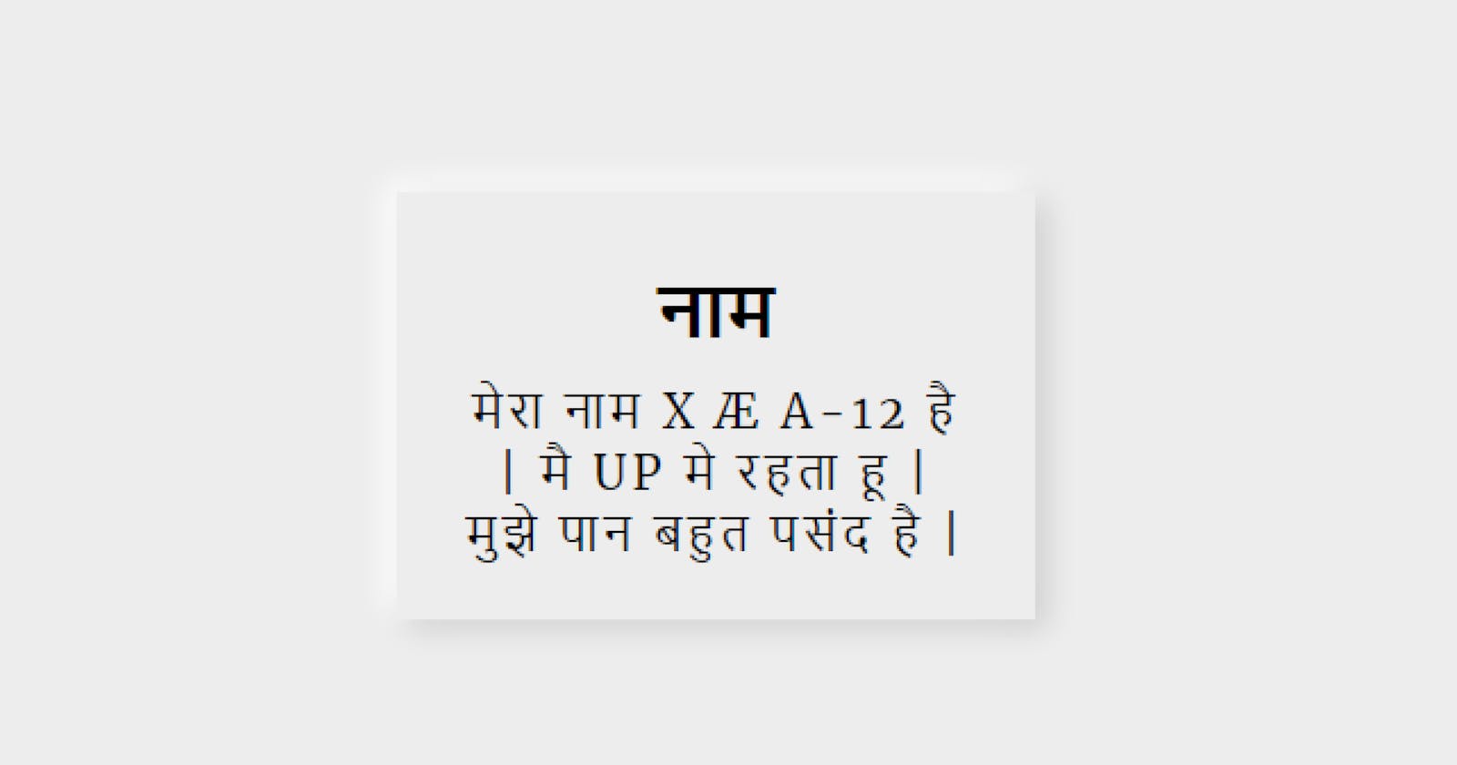
Not gonna mention how neumorphic design works, I'll jump straight into the main code:
<!-- This is an example card template in html -->
<div class="parent">
  <div class="card">
    <h2>नाम </h2>
    <p>मेरा नाम  X Æ A-12  है | मै UP मे रहता हू | मुझे पान बहुत पसंद है |</p>
</div>
</div>
First we need to give some color to the parent of the element in which we want shadow.
Take a look:
.parent{
  background-color:#f2f2f2;
}
Now it's time to give styling to the card item.
Box-shadow property do this job. First we need to mention the dark shadow of
the card giving values like
x: 4px | y: 3px | Blur : 10px | color: #00000022)
(last 2 digit is for alpha(opacity))
Then we give the opposite values which makes shadow of one corner bright.
x: 4px | y: 3px | Blur : 10px | color: #ffffff
.card{
  width:20%;
  box-shadow: 4px 3px 10px #00000022,
              -4px -3px 10px #ffffff;
}
With this concept we can make any type of neumorphic design. Play with this fun concept and see what you can come up to.
